Using Color for Fabric Design: Palettes, Inspiration, and How Fabrics Change Color
Color is a designer's most immediate tool. A single hue can evoke emotion, communicate intent, and transform a silhouette. But color doesn't exist in a vacuum—it lives in fabric. The same color appears dramatically different on silk versus linen, on cotton versus polyester. Understanding how fabric affects color perception is as important as choosing the color itself.
How Different Fabrics Display Color
Before selecting your color palette, consider which fabric will carry it. The interaction between fiber, finish, and dye creates distinct visual effects.
Silk: Depth and Luxury
Silk's smooth surface reflects light unevenly, creating depth and subtlety. Deep colors—rich purples, forest greens, jewel tones—appear especially luxurious on silk. The fabric seems to glow from within. Silk works well for:
- Evening wear where color should feel sophisticated
- Bedroom linens where you want quiet elegance
- Scarves and accessories where the color should draw attention
- Formal wear where depth and richness matter
Light colors on silk can feel ethereal; they almost shimmer. Dark colors on silk feel mysterious and expensive.
Linen: Airy and Casual
Linen has a slightly matte surface that diffuses light evenly. Color on linen appears fresh, approachable, and grounded. Pastels and soft tones pair beautifully with linen's natural texture, creating an airy, comfortable aesthetic. Linen excels with:
- Pastel palettes paired with white or cream accents
- Summer garments where casual elegance is the goal
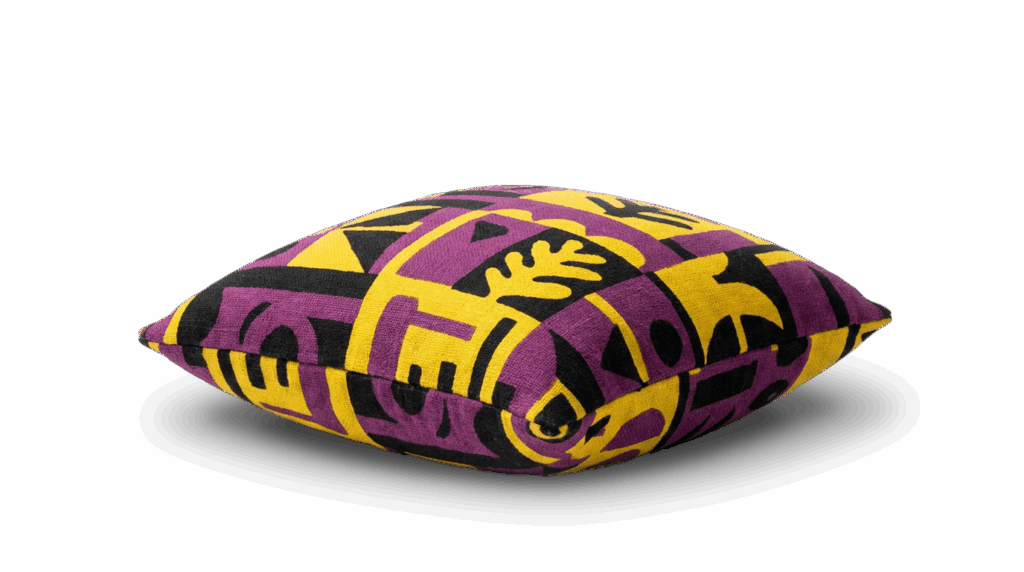
- Interior textiles (curtains, cushions, runners) with soft colors
- Designs with minimal pattern where the color and texture speak
Bright colors on linen work too, but the fabric's matte quality keeps them from feeling electric—instead, they feel natural and wearable.
Cotton: Versatile and Pattern-Friendly
Cotton's neutral appearance becomes a canvas. All colors work on cotton, but patterns and bold combinations especially benefit from cotton's calm, absorptive quality. The color neither glows nor diminishes; it simply exists. Cotton is ideal for:
- Patterned designs with multiple colors
- Everyday wear where color needs to be practical
- Children's clothing with bright, playful hues
- Projects where fabric shouldn't compete with the design
Cotton's affordability and universal acceptance make it the go-to choice when color is the star.
Polyester: Saturation and Durability
Polyester holds color brilliance exceptionally well. Colors on polyester feel saturated and vivid, maintaining their intensity through many wash cycles. Polyester works well when:
- Color durability matters (sportswear, outdoor gear, frequently washed items)
- You want colors to remain bright after repeated use
- Working with modern, graphic designs where color pop is important
- Designing functional garments where aesthetics and practicality both matter
Timeless Color Palettes Rooted in Nature
While fashion trends shift seasonally, certain color combinations have enduring appeal because they're rooted in nature and human experience.
Soothing Neutrals
Ecru, off-white, cream, soft beige, and warm grays create calm, sophisticated spaces and wardrobes. These colors suggest:
- Minimalism and clarity
- Natural, organic aesthetics
- Quality over flash
- Timeless, enduring style
Neutral palettes pair beautifully with natural textures (linen, organic cotton) and allow the fabric itself to be a design element. They're especially effective in home décor and minimalist fashion.
Ocean-Inspired Hues
Water has inspired designers across centuries. The palette spans:
- Light teals and aquas: Tropical, fresh, optimistic
- Mid-tone blues: Serene, peaceful, trustworthy
- Deep navy and midnight blue: Sophisticated, classic, calming
- Seafoam green: Ethereal, subtle, natural
Ocean colors work especially well when paired with flowing silhouettes, fluid fabrics, and nautical or water-inspired patterns. Back in 2020, the fashion industry leaned heavily on ocean palettes for spring/summer collections—a trend that reflects the enduring appeal of water-inspired hues.
Earth and Forest Tones
Green represents growth, renewal, and nature. The palette ranges from:
- Soft sage and celadon: Gentle, natural, sophisticated
- Forest and hunter green: Bold, grounded, timeless
- Olive and khaki: Functional, earthy, warm
- Lemon yellow and chartreuse: Energetic, unexpected, vibrant
When paired with functional garments—utility wear, cargo silhouettes, performance fabrics—earthy greens feel modern and practical. Historically, 2020 fashion embraced these tones in technical garments and functional design, reflecting broader interest in outdoor wear and natural materials.
Warm Sunset Palette
Orange, red, fuchsia, purple, and warm reds create energy and drama:
- Coral and salmon: Optimistic, warm, approachable
- Deep red and burgundy: Passionate, formal, luxurious
- Fuchsia and magenta: Bold, contemporary, playful
- Warm orange and rust: Earthy, nostalgic, inviting
- Purple and plum: Regal, imaginative, spiritual
Sunset colors work for both fashion and interior design. They're especially striking on natural fabrics where the warmth feels inviting rather than artificial.
Building Your Color Story
When designing custom fabrics, consider:
Emotion. What feeling should the color create? Calm (neutrals, blues), energy (warm colors, brights), sophistication (deep jewel tones)?
Context. What's the fabric for? Everyday wear, special occasion, home décor? This influences whether bold, saturated colors work or softer tones are better.
Fabric choice. Which fabric best shows off your chosen colors? Does silk's luxury suit your palette? Does cotton's neutrality let your pattern shine?
Longevity. Are you chasing a trend or creating something enduring? Timeless color palettes transcend seasonal fads.
Complementary tones. Which colors naturally pair with your primary choice? Nature offers excellent guidance—observe autumn foliage, ocean water, sunrise—and you'll find natural combinations that harmonize.
Selecting and Customizing Your Fabric
Ready to explore colors in fabric? [link to Vivix Prints color fabrics] offers options across all major fabric types. Experiment with color palettes by uploading your design and seeing it rendered in different fabrics and hues.
Want to compare how the same color appears on silk, linen, and cotton before committing? [link to Vivix Prints fabric samples] and [link to Vivix Prints fabric book] include color swatches across all our major fabrics, so you can evaluate how each surface treats color, saturation, and light reflection.
Unsure which fabric best showcases your chosen palette, or want guidance on color pairing and how historical trends might inform your contemporary design? [link to Vivix Prints contact page] — our team has experience with color across fabric types and can help you achieve the exact aesthetic you're envisioning.